Artists in the past worked diligently on their portfolios and slides, keeping them updated for gallery curators to review. Today it is all about the internet and having a great portfolio website. Here are 7 things to consider before you jump in and begin work on your new website.
Let the Artwork Speak
Take care not to overwhelm the user (when I say user I mean the person viewing your site) with the design of your portfolio website. Keep it clean and let your artwork speak for itself. Think of your website as a gallery for displaying your art and only use design when needed. It is OK to incorporate a little personality, just don’t over do it.
Use Large Images
Artists are often hesitant to publish large images of their work; afraid people might steal the images. The benefits of making your images large far outweigh not doing so. Keep in mind that when I say use large images I mean images 500-1000 pixels wide. Images of this size do not make good prints but are large enough to give users an idea what your artwork is like.
Include Detail Shots if Possible
Most art is larger than 500 pixels wide in real life and this fact will make if difficult for users to see what is going on in your images. When possible, include some detail shots of your favorite part of your artwork. This will give the user an idea what things might look like up close. Try to focus on texture, intense areas of color, intricate line, etc.
Make it Personal?
I phrase this as a question, because some artists may opt for a less personal approach. Below are some things to think about when deciding which approach to take with your portfolio website.
Personal – Think of sites with a touch of personality as an exhibition opening. At an opening you get the opportunity to interact with the artist, learn about the process, successes and failures, etc. Try to use words to portray how someone might perceive you if they were to meet you in person. Be transparent and share what worked, what didn’t, why you chose to do something a certain way, etc. I realize that many fine artists are visual and not much for self promotion, but consider that the lack of information creates a more sterile environment for your work.
Sterile or Impersonal – Choose what information you share carefully if your work needs to stand alone with no influence of the person behind the work. Sometimes artwork needs to stand alone to communicate a message effectively. If you feel your artwork needs to stand alone, then consider carefully what information you share and the design of your portfolio website. Every word you write and each element of design on your website will impact the user experiencing your work. For a sterile and clean portfolio website, only add what is needed to communicate your artwork to the user.
Use Simple Navigation
Again, the goal is to show your work, not some “cool” portfolio website. Use navigation elements that users already know how to use and quickly understand. If you frustrate them with clunky navigation, they will leave you in a matter of seconds.
Include Your Contact Information
Make sure that you include ways for people to contact you. Include your name, email and phone number. You can always create a second email address and phone number if you are paranoid about sharing your real information. If you are fairly tech savvy you can use Google Apps to create an address for your domain. Example: showus@todayinart.com is one of these and is not my “real” email address. Another option would be to create a new email account using a free service like gmail, yahoo, etc.
For a new phone number you can use a service like Google Voice, which can forward to your real phone during hours of your choosing, send transcribed text messages of your voice mail, and more. There are other services out there besides Google, but this is what I use.
Be a Good Editor
Make sure that you include only your best work. It is better to have a few great pieces of art than a bunch of crap that nobody wants to see. One of the quickest ways to get rid of a user is to show them some terrible work.
A few examples

anthonyfreda.com is clean, focuses first on the artwork and is easy to navigate. I do wish that he spoke more about the process and his approach to his work in the bio area. He does talk about these things, but you have to look at the blog to read it.

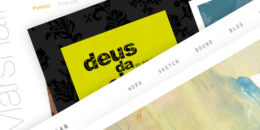
deusdachuva.com.br expresses more personality, is easy to use and switches things up a little by using a horizontal scroll. This website is beautifully executed.

annmarshallart.com is clean, easy to use and shows her work well with large images.

jamesjean.com is another clean website using large wonderful images and is super easy to navigate.
Whether you build your own portfolio website or hire someone to do it for you, keep these tips in mind. I know this post just scratches the surface of the topic. I will be writing more about ways to create a portfolio website to show off your artwork.